

2023
2023
2023
2023
CANDID
YEAST INFECTION TREATMENT KIT
CANDID
YEAST INFECTION TREATMENT KIT
CANDID
YEAST INFECTION TREATMENT KIT
CANDID
YEAST INFECTION TREATMENT KIT
Branding + Packaging
Branding + Packaging
Branding + Packaging
Branding + Packaging
COLLABORATIVE PROJECT
COLLABORATIVE PROJECT
Katherine Bodenschatz
Industrial Design
Katherine Bodenschatz
Industrial Design
Elise Johnson
Communication Design
Elise Johnson
Communication Design
Elise Nyktas
Communication Design
Elise Nyktas
Communication Design
Evan Pugh
Communication Design
Evan Pugh
Communication Design

PROBLEM
PROBLEM
Even though yeast infections are among one of the most common vaginal infections, over-the-counter treatments do not respect the dignity of the person. They do not enhance feelings of support or education for both first-time and experienced users.
Even though yeast infections are among one of the most common vaginal infections, over-the-counter treatments do not respect the dignity of the person. They do not enhance feelings of support or education for both first-time and experienced users.
SOLUTION
SOLUTION
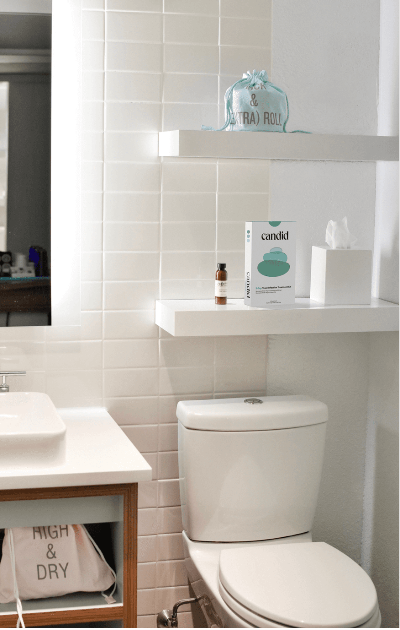
Candid is comprehensive and supportive care for all women. From research to final visualization and production, Candid was created to make yeast infection treatments feel like a form of self-care.
Candid is comprehensive and supportive care for all women. From research to final visualization and production, Candid was created to make yeast infection treatments feel like a form of self-care.

IDENTITY
IDENTITY
IDENTITY
IDENTITY

Dignified. Intuitive. Supportive. Confident. Honest. Approachable.
Dignified. Intuitive. Supportive. Confident. Honest. Approachable.
Dignified. Intuitive. Supportive. Confident. Honest. Approachable.
Dignified. Intuitive. Supportive. Confident. Honest. Approachable.

GRAPHIC LANGUAGE
GRAPHIC LANGUAGE
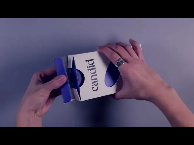
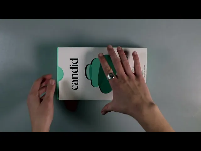
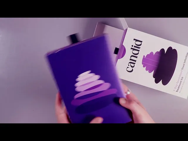
Candid's graphics reflect the balance between dignified and bold. The design combines soft exterior graphics with a bold interior. This contrast allows for Candid to be both approachable on the shelf, while instilling confidence in the user.
Candid's graphics reflect the balance between dignified and bold. The design combines soft exterior graphics with a bold interior. This contrast allows for Candid to be both approachable on the shelf, while instilling confidence in the user.
The color pallet utilized the existing convention used by other treatment kits; blue is 1-day treatment, green is 3-day treatment, and purple is 7-day treatment.
The color pallet utilized the existing convention used by other treatment kits; blue is 1-day treatment, green is 3-day treatment, and purple is 7-day treatment.

RESEARCH
RESEARCH
RESEARCH
RESEARCH
MARKET ANALYSIS
MARKET ANALYSIS
The existing market neglects dignity and discretion. Products are not intuitive in the decision process of this pivotal moment.
The existing market neglects dignity and discretion. Products are not intuitive in the decision process of this pivotal moment.
TARGET
TARGET

CVS
CVS


COLOR ANALYSIS
COLOR ANALYSIS
1-day treatments are blue, 3-day treatments are green, 7-day treatments are purple across all brands.
1-day treatments are blue, 3-day treatments are green, 7-day treatments are purple across all brands.
DESIGN
DESIGN
Hierarchy issues throughout. Loud, sterile typography overloaded with medical jargon.
Hierarchy issues throughout. Loud, sterile typography overloaded with medical jargon.
COMPETITOR ANALYSIS
COMPETITOR ANALYSIS
Medicinal design lacks comfort and empathy. Overwhelming instructions and confusing graphic hierarchy make the process unpleasant. Organization of product components is unsanitary; does not feel sterile.
Medicinal design lacks comfort and empathy. Overwhelming instructions and confusing graphic hierarchy make the process unpleasant. Organization of product components is unsanitary; does not feel sterile.

USER NEEDS
USER NEEDS
Since such a wide range can experience a yeast infection, it is important to identify the range of users who may be on the market for treatment.
Since such a wide range can experience a yeast infection, it is important to identify the range of users who may be on the market for treatment.

PRODUCT
PRODUCT
PRODUCT
PRODUCT
PACKAGING
PACKAGING
Compartmentalized system and simplified steps guides the user through experience. Handling of the ovule and applicators respects needs regarding cleanliness.
Compartmentalized system and simplified steps guides the user through experience. Handling of the ovule and applicators respects needs regarding cleanliness.


PACKAGING
PACKAGING
Compartmentalized system and simplified steps guides the user through experience. Handling of the ovule and applicators respects needs regarding cleanliness.
Compartmentalized system and simplified steps guides the user through experience. Handling of the ovule and applicators respects needs regarding cleanliness.


USAGE
USAGE
Each component of the internal packaging is presented to the user in a series of steps. All parts are stored neatly, without jeopardizing the integrity or sanitation of the product.
Each component of the internal packaging is presented to the user in a series of steps. All parts are stored neatly, without jeopardizing the integrity or sanitation of the product.


pughevanc@gmail.com

pughevanc@gmail.com